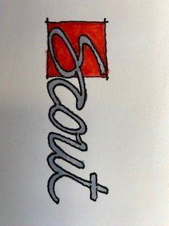
Started doodling Scout logo ideas. Two thoughts I was thinking
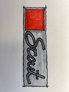
1-any color in the logo should be a red tone to tie back to the original iH logos. Maybe it’s a more modern or vintage shade of red.
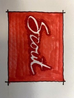
2-since we are all about heritage and it’s an EV company I think signage should have the whole word on red or the “S” on red and what is on red should be done with white Neon tube lighting. Neon would be a great way to represent Electric and would give a feel of nostalgia.
Other manufacturers are stuck with their current monikers but as a “start-up” there is complete freedom and hey-who doesn’t like a little vintage neon signage.
Then maybe the vehicle logo is classic script with a little pop of red. I liked the square since we all keep saying boxy design and it ties back to a vehicle that thinks OUTSIDE THE BOX.
Critique away.
1-any color in the logo should be a red tone to tie back to the original iH logos. Maybe it’s a more modern or vintage shade of red.
2-since we are all about heritage and it’s an EV company I think signage should have the whole word on red or the “S” on red and what is on red should be done with white Neon tube lighting. Neon would be a great way to represent Electric and would give a feel of nostalgia.
Other manufacturers are stuck with their current monikers but as a “start-up” there is complete freedom and hey-who doesn’t like a little vintage neon signage.
Then maybe the vehicle logo is classic script with a little pop of red. I liked the square since we all keep saying boxy design and it ties back to a vehicle that thinks OUTSIDE THE BOX.
Critique away.